Introducing the evolution of the Circle Express brand.
1 October 2018
We are proud to unveil our new look brand. Working alongside specialist branding agency Design Inc, we have a devised a creative and strategic brand evolution of the existing and well-known brand marque.
It was clear from the start, that the existing Circle Express identity possessed too much brand equity for it to be totally replaced. Not only was the original brand already very well respected and recognised but also, the original logo already represented our basic company values. As such, the new brand concept was a ‘refreshing’ of the existing brand that we will be implementing with a soft approach over time.
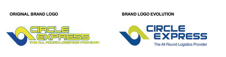
Although appearing somewhat outdated in execution, the original Circle Express brand already symbolised a two directional movement (depicting delivery and collection) ‘wrapped’ in stylised caring ‘hands’ shape around a circle. And, with both the company’s name and service offering remaining, a gradual step-by-step approach to the re-visualisation of the brand was the best use of resources. Rather than a wholesale change.
The new brand logo is now sufficiently different to showcase a more modern approach but, at the same time, it retains enough of the existing style & brand values to ensure long-term customers of a continued service level.
Compared with the original brand, the new Circle Express logo has been differentiated through modernisation: a better use of colour, styling and positioning.
The colours used here are still blue and yellow(ish) but have been brought in line with the brand colours of our parent company, Rico Group. Furthermore, whilst we have retained the strong & secure font style (albeit with some subtle tweaks), we felt the keyline was uncomfortable and a little confusing and, as such, this has been removed and the letters have been carefully kerned. Moreover, the company name now stands more confident in its darker blue.
Tom Ryan, Managing Director, Circle Express commented: “We’re delighted to be unveiling our fresh new look, one that simultaneously recalls Circle Express’ freight heritage while also bringing the brand up-to-date. Our trademark symbol is still instantly recognisable, as is the familiar Circle Express name, but by modernising the design we’re indicating a step-change that mirrors a change in our customers’ needs. It’s an exciting time for both us and our customers – old and new.”
David Parker, Design Incorporated’s Brand & Marketing Specialist said: “We took the best of the brand’s heritage – reflecting the logo’s decade of origin – which is something you will see in all the sectors’ household name brands – whilst reinventing the marque to inspire the future business plans. We unravelled what makes Circle Express a great freight partner and teased out the strands of the brand’s weave to tailor a new outfit for a market leader.”